


We’re making the infographics and charts from this issue of the ReThink Quarterly available for anyone to use in their own presentations and reports.
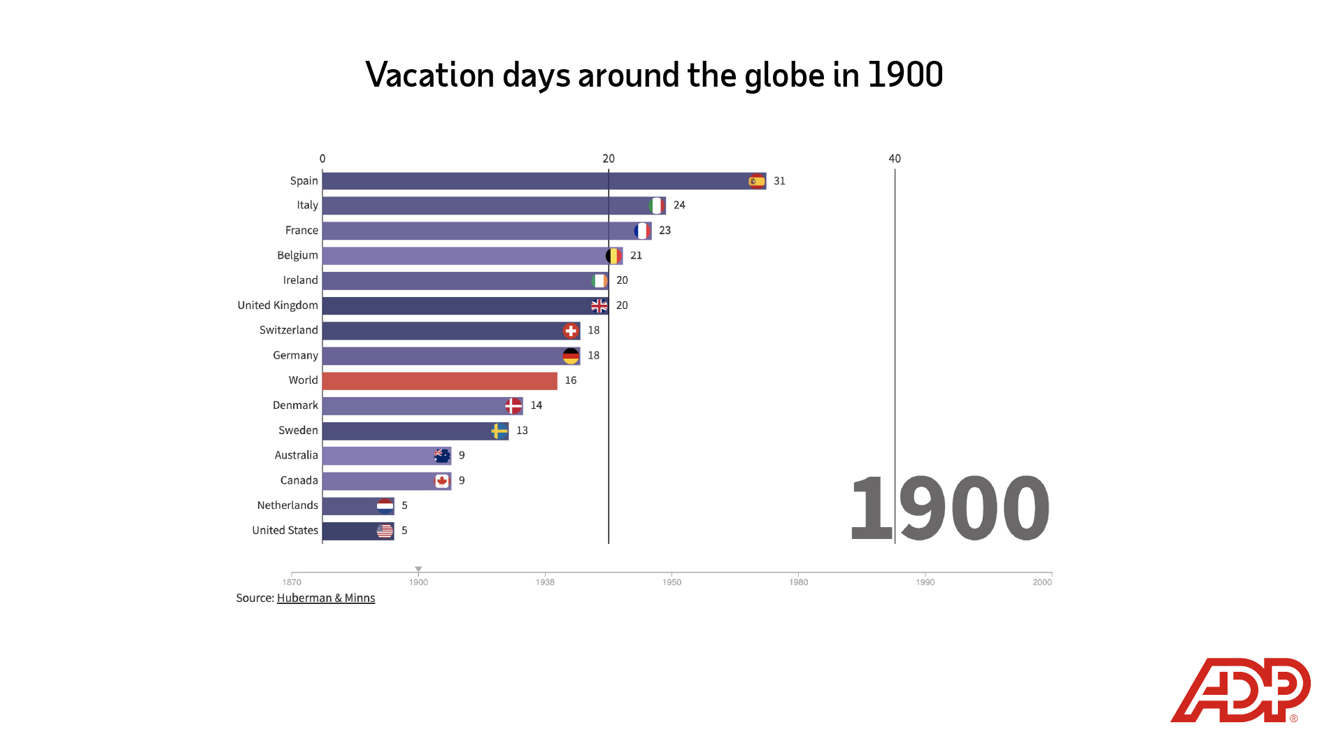
Evidence of people taking “vacations” dates back to at least the Roman Empire. But paid time off for workers was rare until the 1920s.
Embed this visualization
<div class="flourish-embed flourish-chart" data-src="visualisation/8928509"><script src="https://public.flourish.studio/resources/embed.js"></script></div>
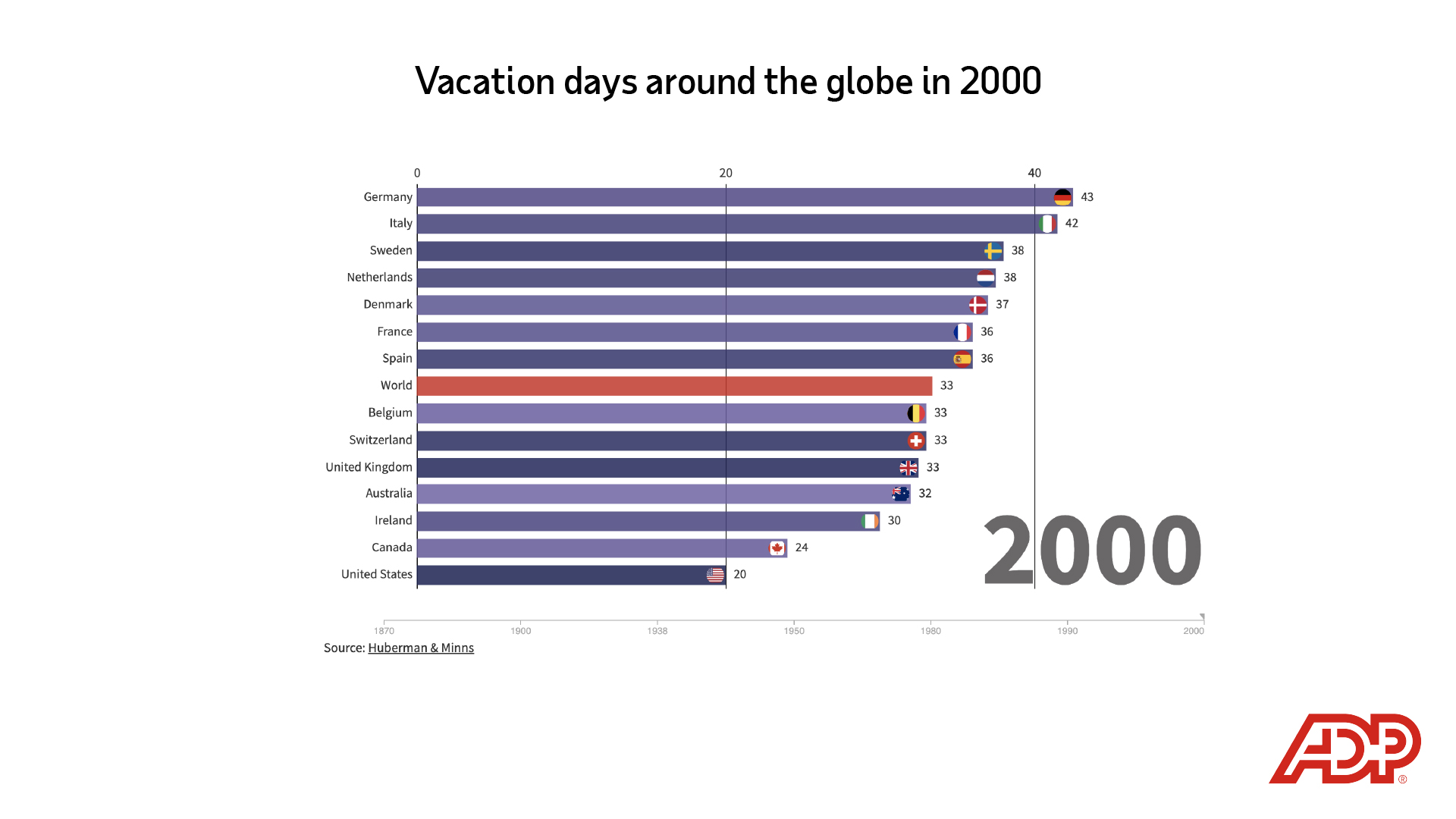
The average number of paid days off — including vacation time and national holidays — was only 13.8 in 1870. By 2000, it had more than doubled to 33.4 days.
Embed this visualization
<div class="flourish-embed flourish-chart" data-src="visualisation/8928509"><script src="https://public.flourish.studio/resources/embed.js"></script></div>
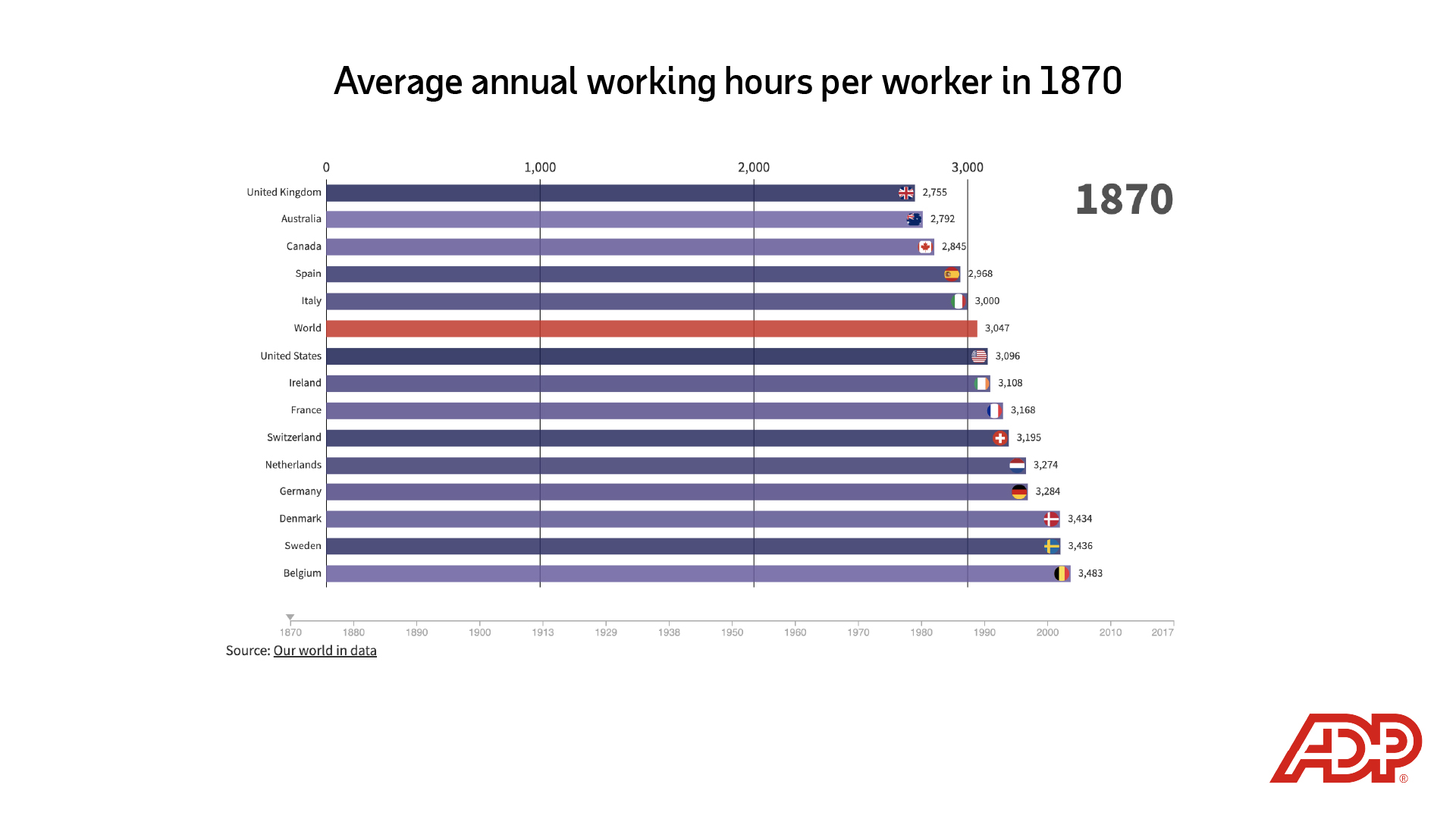
In the 19th century, as the Industrial Revolution took shape in what’s now considered the developed world, workers put in long hours. In 1870, people in some countries worked almost twice as much as they do now and got no paid days off.
Embed this visualization
<div class="flourish-embed flourish-chart" data-src="visualisation/8976097"><script src="https://public.flourish.studio/resources/embed.js"></script></div>
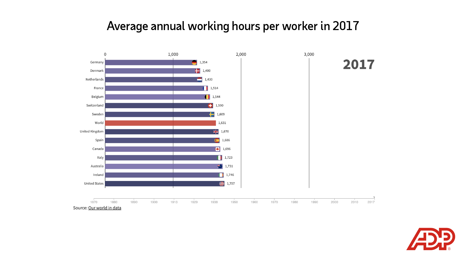
In 1870, the average number of hours a worker spent on the job each year was 3,047, or nearly 60 hours per week. By 2017, the average had been reduced by half, to 1,631 hours. The increased number of vacation days accounts for part of the decline, while a large part is attributed to legal mandates on maximum weekly and daily work hours.
Embed this visualization
<div class="flourish-embed flourish-chart" data-src="visualisation/8976097"><script src="https://public.flourish.studio/resources/embed.js"></script></div>

Countries that industrialized early have the lowest average work hours; workers in the developing world continue to work significantly more.
Embed this visualization
<iframe title="Average weekly working hours" src="https://datawrapper.dwcdn.net/8P0Xn/5/" frameborder="0" height="410"></iframe>
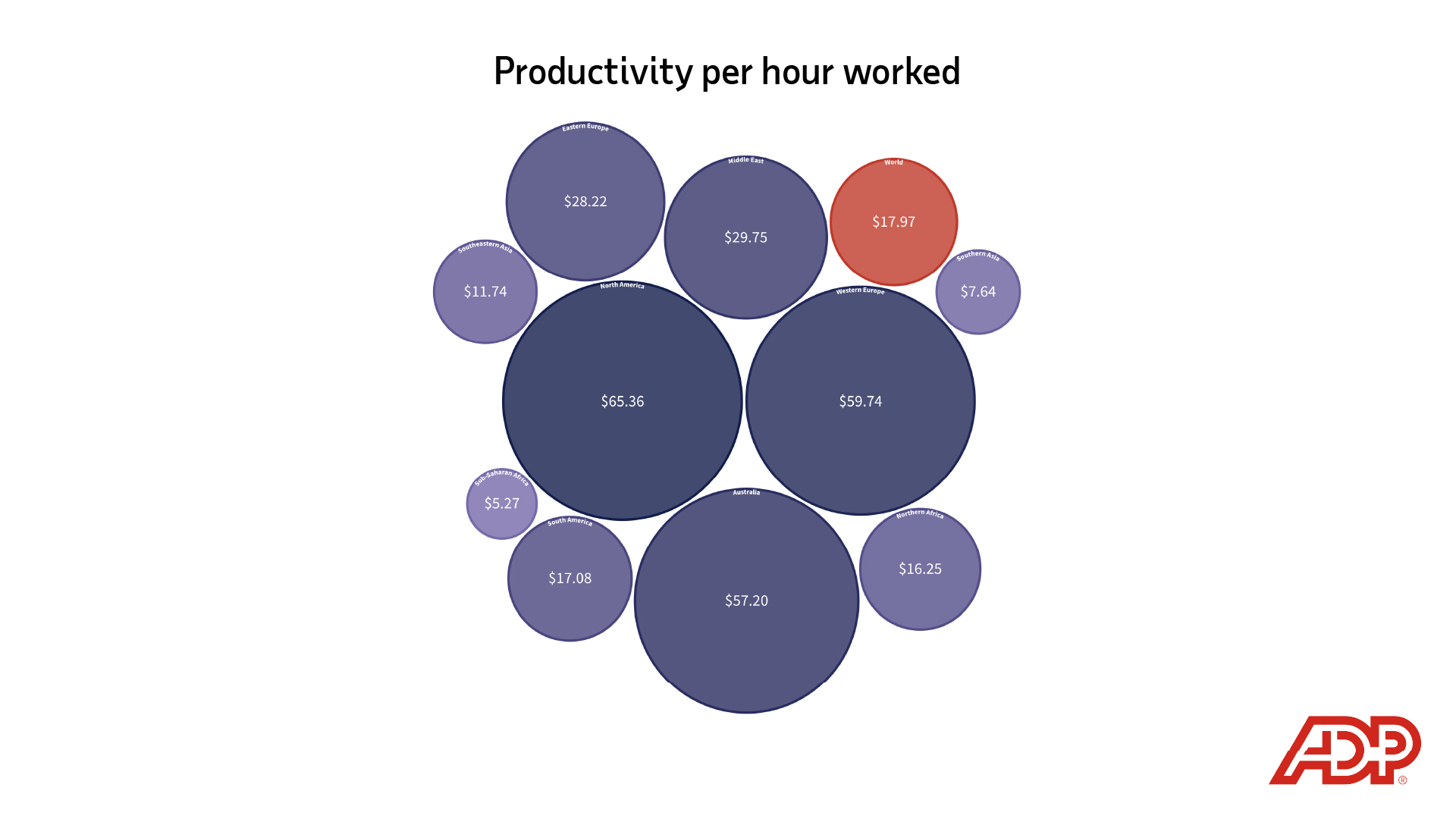
Though workers in some developing nations are working substantially more than those in industrialized nations, the value of those working hours remains lower. The chart above depicts productivity by world region as measuring an average work hour’s share of the gross domestic product.
Embed this visualization
<div class="flourish-embed flourish-chart" data-src="visualisation/9012078"><script src="https://public.flourish.studio/resources/embed.js"></script></div>
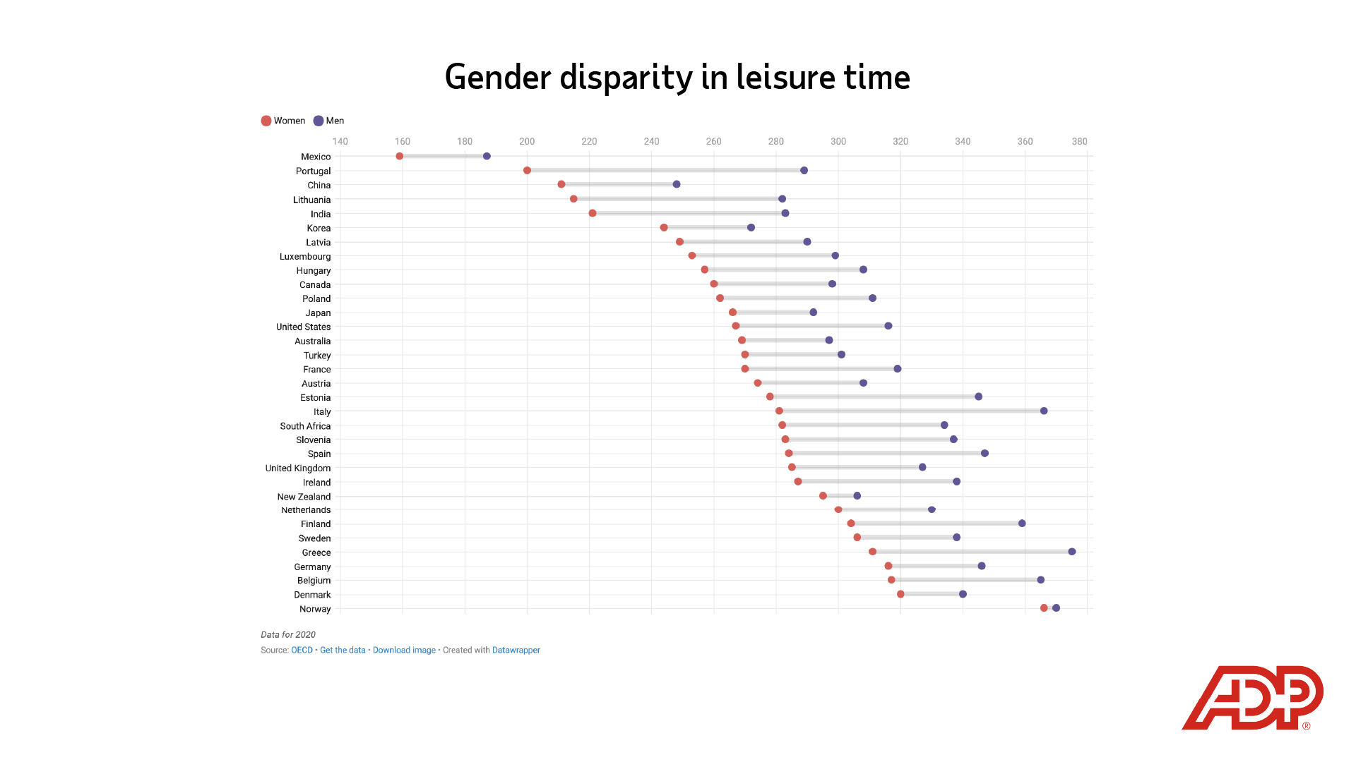
Around the world, women work more than men and spend less time on leisure. The disparities are huge even in Europe. For instance, in Italy women spend around 280 minutes a day on leisure activities, while men have 366 minutes. Norway has the highest amount of leisure time and is the only country where the gender divide is almost equal, though leisure time is still lower for women.
Embed this visualization
<iframe title="Gender disparity in leisure time" src="https://datawrapper.dwcdn.net/862s7/5/" frameborder="0" height="410"></iframe>
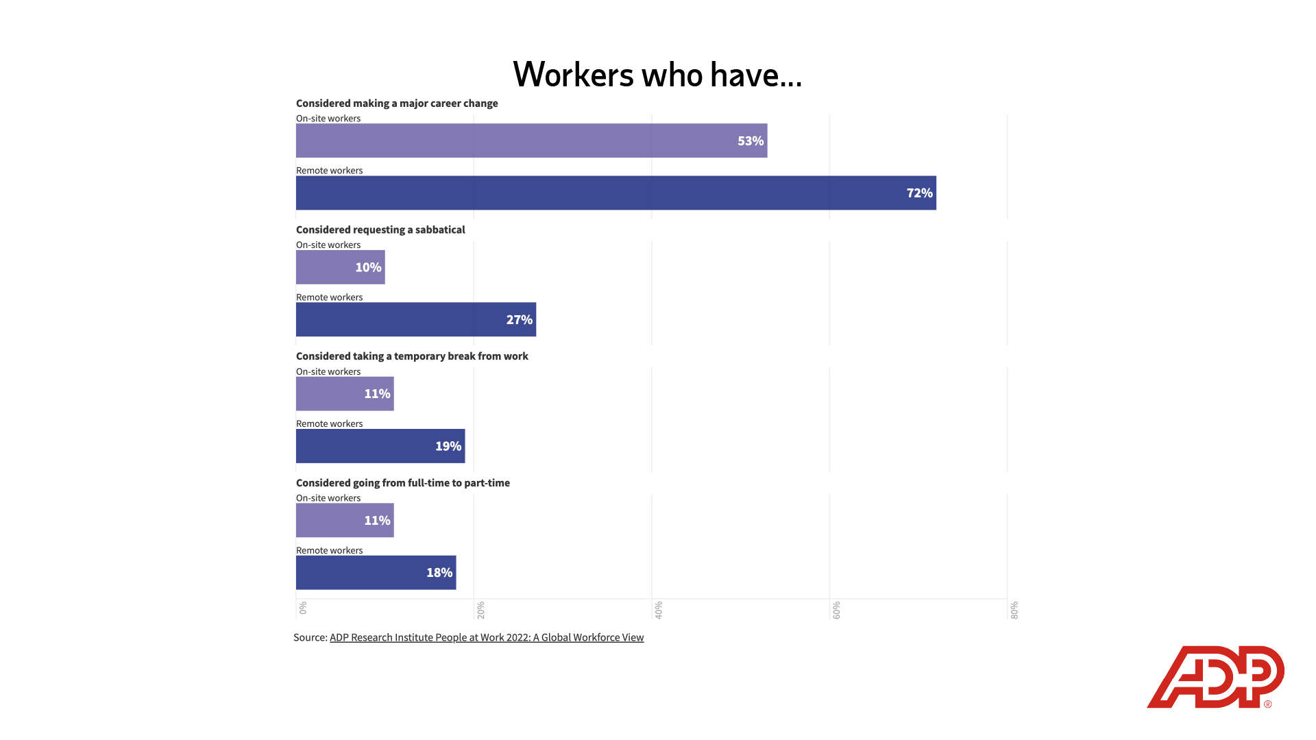
People who work remotely are more likely to be considering major career changes in 2022, the ADP Research Institute found in its new report People at Work 2022: A Global Workforce View.
Embed this visualization
<div class="flourish-embed flourish-chart" data-src="visualisation/9799807"><script src="https://public.flourish.studio/resources/embed.js"></script></div>
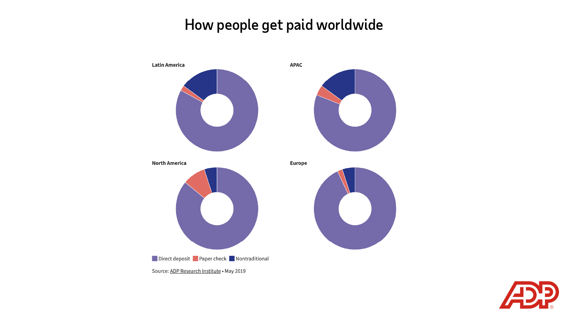
Very few people actually touch paper checks anymore. The ADP Research Institute in 2019 found that more than 80% of workers globally are paid via direct deposit.
Embed this visualization
<div class="flourish-embed flourish-chart" data-src="visualisation/9409361"><script src="https://public.flourish.studio/resources/embed.js"></script></div>
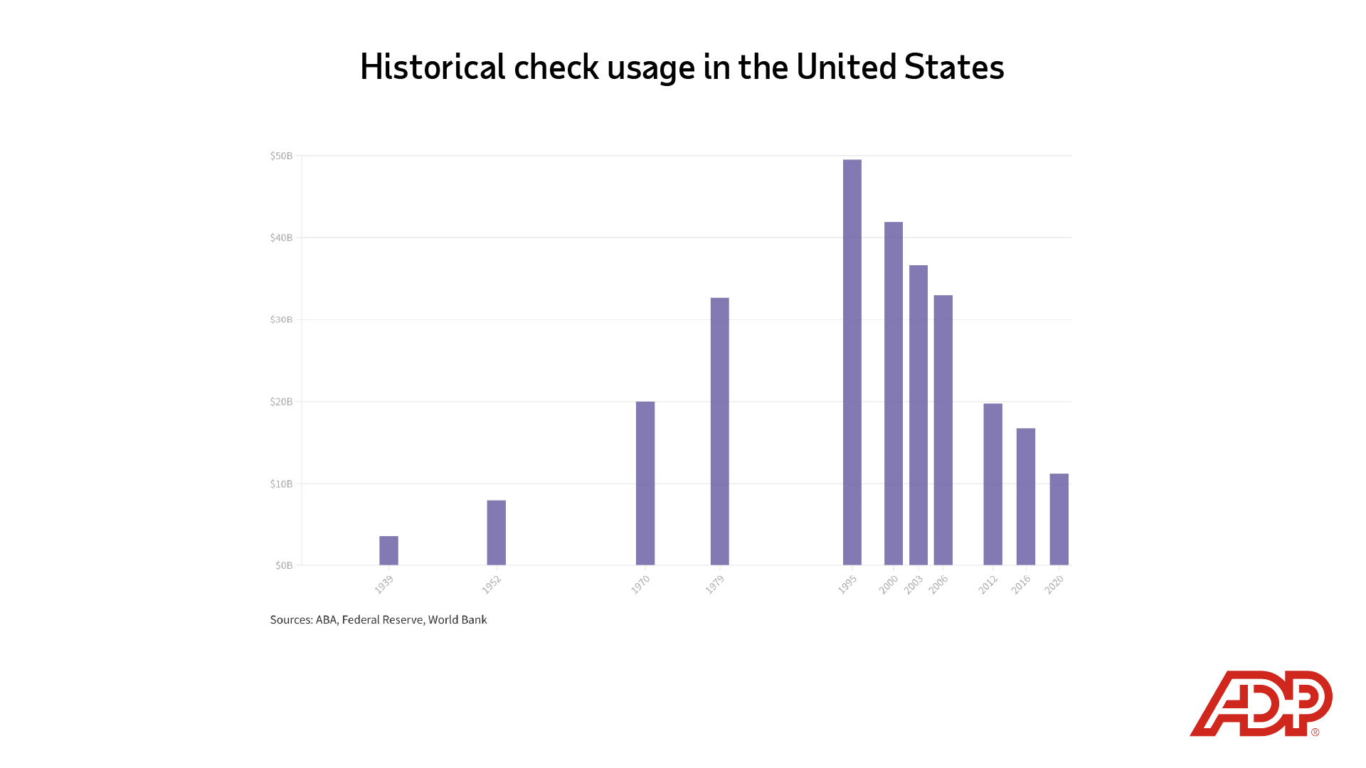
In the United States, check payments accounted for almost 80% of all purchases in 1995 but fell to about 45% in 2004 and just 7% in 2017.
Embed this visualization
<div class="flourish-embed flourish-chart" data-src="visualisation/9480053"><script src="https://public.flourish.studio/resources/embed.js"></script></div>
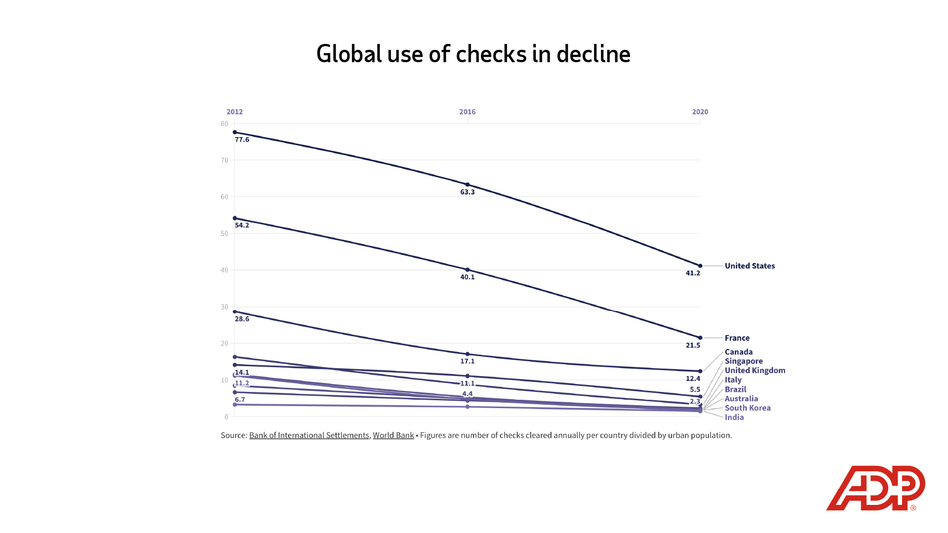
Use of the paper check remains notable in the United States, France and Canada, though it has declined significantly since 2012.
Embed this visualization
<div class="flourish-embed flourish-chart" data-src="visualisation/9396340"><script src="https://public.flourish.studio/resources/embed.js"></script></div>
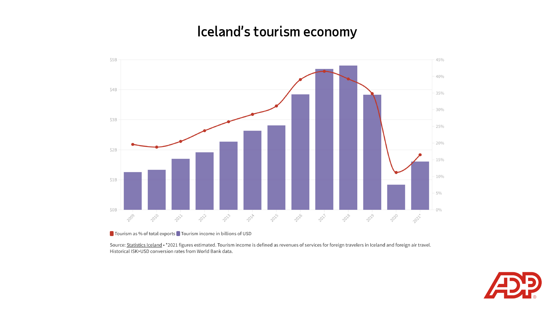
Leading up to the Covid-19 pandemic, tourism had been Iceland’s largest export for several years.
Embed this visualization
<div class="flourish-embed flourish-chart" data-src="visualisation/9287076"><script src="https://public.flourish.studio/resources/embed.js"></script></div>
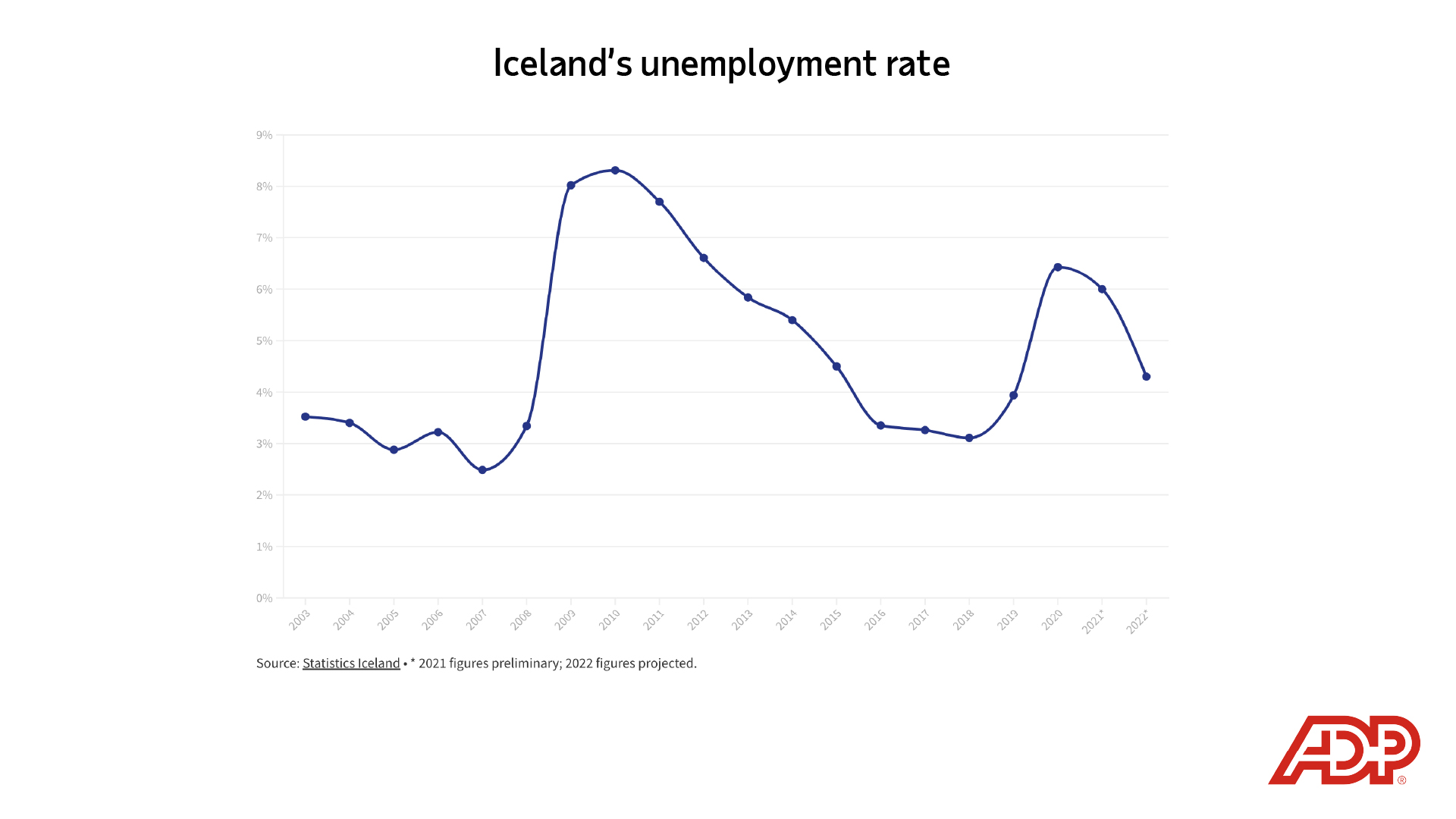
The road to recovery has been slow, but the labor market situation in Iceland has improved. The government projects that the unemployment rate will sink to 4.3% in 2022, close to pre-pandemic levels.
Embed this visualization
<div class="flourish-embed flourish-chart" data-src="visualisation/9287645"><script src="https://public.flourish.studio/resources/embed.js"></script></div>
Sign up to keep up to date with ReThink Q.